
How to Review Your Sales Page Before Launch: Why I Built YetiCritic
Published 31 October 2026 · By Craig Galloway
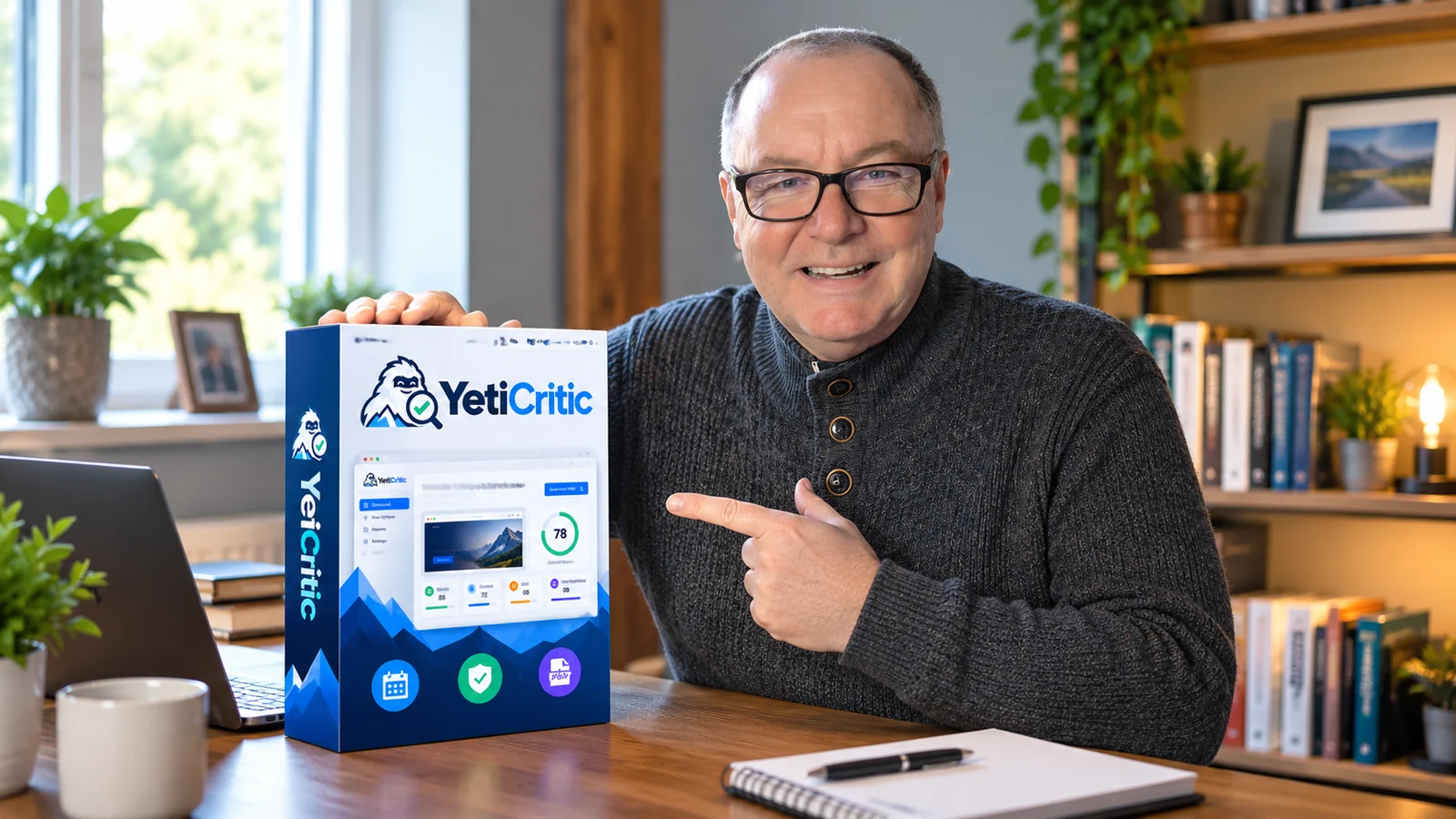
I build a lot of software at SaaSYeti. And because I create the products myself, I usually create the sales pages as well. There is a satisfying moment when the software works, the page looks finished and the purchase button is ready. It is tempting to call the job done.
But I realised I had developed a habit: I was publishing some sales pages without giving them a proper second opinion first.
I would check that the layout worked and the links opened. What I wasn't always doing was looking at the page as a first-time visitor who knew nothing about the software. Was the benefit obvious? Did I explain who it was for? Was there enough proof near the top? Did I make the next step easy?
That gap between a page being finished and a page being clear is why I built YetiCritic.
Why a good-looking sales page can still need work
When you have built something yourself, you know what it does. Your visitors don't. A sentence that makes perfect sense to you might leave someone else wondering why they should care. And a design can look polished while the most important explanation sits three screens down.
I began paying closer attention to five questions:
- Clarity: Can somebody understand the offer within a few seconds?
- Audience: Is it obvious who the product is for and what problem it helps solve?
- Trust: Is there believable evidence, a real example or an explanation of what buyers receive?
- Call to action: Is the next step easy to find, with wording that matches the offer?
- Buying confidence: Are the price, access period, refund terms and any limitations explained without making people hunt for them?
These are worth checking whether you sell your own software, promote an affiliate offer, create a lead-generation page or build funnels for clients.
What happened when I critiqued my own sales page?
Instead of treating YetiCritic as something only other people should use, I ran its own sales page through the tool. An early critique returned 74/100. It flagged weaknesses around trust, pricing clarity and giving visitors enough visible proof of the actual report.
I made changes, showed more of the real output and explained the purchase terms more clearly. In a later self-assessment dated 31 October 2026, the page scored 82/100. That assessment also pointed out another problem: I had started repeating the same explanations too often. So I simplified the middle of the page and moved the strongest proof higher up.
Those numbers are AI critique scores, not measured increases in sales or conversion rate. Different versions of a page and different assessments can produce different scores. What mattered to me was getting a list of specific things I could inspect and improve, rather than simply hearing that the page looked fine.
You can see the self-audit comparison and supporting reports on the YetiCritic sales page, including the earlier page and the detailed critique.
A beta tester spotted something I had hoped YetiCritic would catch
I also invited people who work on websites to try it. One of them was Weibin Sim, who builds websites and funnels for small businesses and coaches.
“I build websites and funnels for small businesses and coaches. I ran my own site through YetiCritic and it caught something I'd missed: the text over my hero image was hard to read on mobile. It also flagged the lack of proof near the top. The suggestions were specific enough to act on straight away. A handy second opinion before a page goes live.”
Weibin Sim, heysimmm.com (beta tester)
That is the kind of result I want from this tool. Not a vague instruction to “improve your website”, but a particular issue you can look at and decide whether to fix.
How YetiCritic works
YetiCritic is an AI sales page and marketing-material critique tool. It provides a structured second opinion on what is visible in the material you upload. You don't have to install anything on your website.
- Capture the page. Upload a screenshot, or save a longer sales page as a PDF so the entire sequence can be reviewed.
- Run a critique. The tool reviews areas such as clarity, visual hierarchy, trust and calls to action, and gives an overall assessment.
- Read the priorities. You receive a written explanation of what appears to be working, what may need attention, practical recommendations and suggested headline or CTA alternatives where appropriate.
- Decide what to change. Keep the report, make the changes that make sense for your audience, and review the page again if you want to compare your work.
You can revisit your critique history and download reports. A complete PDF counts as one critique, even when it contains multiple pages. YetiCritic includes the AI processing, so you don't need to provide your own OpenAI API key.
Watch the YetiCritic promotional video
Here's a short introduction to the software and the sort of feedback it can provide.
If the video doesn't load in your browser, watch it on the YetiCritic sales page.
My practical sales page checklist before publishing
Even if you never use an AI critique tool, these are the checks I'd recommend making before sending traffic to a page.
- Read only the first screen. Can a new visitor identify the product, audience and benefit without scrolling?
- Find the primary action. Is the button easy to spot, and does its wording explain what happens next?
- Check the mobile view. Are hero-image headlines legible? Are the buttons easy to tap? Is important text hidden or squeezed?
- Look for proof. Could you show a real output, a demonstration or a clearly labelled testimonial rather than relying on claims?
- Inspect the actual purchase journey. Test the link and make sure the payment page, access instructions and terms agree with what you promised.
- Remove repeated explanations. If you have made the same point in three different sections, choose the strongest version and simplify the rest.
- Ask for another opinion. A colleague, potential customer or critique tool may notice the thing you've stopped seeing.
For me, the final check is important. I can still make the final decision, but at least I'm not relying entirely on my own familiarity with the page.
Who is YetiCritic for?
I designed it for people who regularly create marketing pages but don't always have someone else available to review them. That includes SaaS founders, affiliate marketers, small businesses, funnel builders, freelancers and creators selling digital products.
It is particularly useful as a pre-publish check, or when a page is already live but you suspect the offer could be explained more clearly. It is not a replacement for analytics, real customer feedback, accessibility testing or conversion experiments. AI suggestions are advisory, and you should judge them against your actual audience and goals.
Try YetiCritic on your next page
YetiCritic currently offers a one-time $9.97 payment for 12 months of access, including 25 critiques per month, with no automatic renewal and no separate OpenAI key required. Monthly allowances reset rather than rolling over. Check the current sales page for the latest terms and refund details.
If you've spent hours getting a page ready and would value another pair of eyes before publishing it, you can see the real reports, the testimonial and the software itself here:
See YetiCritic and its real critique reports
I'm continuing to improve it as people use it. The aim has stayed the same from the beginning: help you notice something useful before your next visitor does.